How to Be an Educated Consumer of Infographics: David Byrne on the Art-Science of Visual Storytelling
by Maria Popova
Cultivating the ability to experience the “geeky rapture” of metaphorical thinking and pattern recognition.
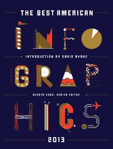 As an appreciator of the art of visual storytelling by way of good information graphics
— an art especially endangered in this golden age of bad infographics
served as linkbait — I was thrilled and honored to be on the advisory
“Brain Trust” for a project by Pulitzer-Prize-winning journalist, New Yorker writer, and Scientific American neuroscience blog editor Gareth Cook,
who has set out to highlight the very best infographics produced each
year, online and off. (Disclaimer for the naturally cynical: No money
changed hands.) The Best American Infographics 2013 (public library)
is now out, featuring the finest examples from the past year — spanning
everything from happiness to sports to space to gender politics, and
including a contribution by friend-of-Brain Pickings Wendy MacNaughton — with an introduction by none other than David Byrne. Accompanying each image is an artist statement that explores the data, the choice of visual representation, and why it works.
As an appreciator of the art of visual storytelling by way of good information graphics
— an art especially endangered in this golden age of bad infographics
served as linkbait — I was thrilled and honored to be on the advisory
“Brain Trust” for a project by Pulitzer-Prize-winning journalist, New Yorker writer, and Scientific American neuroscience blog editor Gareth Cook,
who has set out to highlight the very best infographics produced each
year, online and off. (Disclaimer for the naturally cynical: No money
changed hands.) The Best American Infographics 2013 (public library)
is now out, featuring the finest examples from the past year — spanning
everything from happiness to sports to space to gender politics, and
including a contribution by friend-of-Brain Pickings Wendy MacNaughton — with an introduction by none other than David Byrne. Accompanying each image is an artist statement that explores the data, the choice of visual representation, and why it works.Byrne, who knows a thing or two about creativity and has himself produced some delightfully existential infographics, writes:
The very best [infographics] engender and facilitate an insight by visual means — allow us to grasp some relationship quickly and easily that otherwise would take many pages and illustrations and tables to convey. Insight seems to happen most often when data sets are crossed in the design of the piece — when we can quickly see the effects on something over time, for example, or view how factors like income, race, geography, or diet might affect other data. When that happens, there’s an instant “Aha!”…Byrne addresses the healthy skepticism many of us harbor towards the universal potency of infographics, reminding us that the medium is not the message — the message is the message:
A good infographic … is — again — elegant, efficient, and accurate. But do they matter? Are infographics just things to liven up a dull page of type or the front page of USA Today? Well, yes, they do matter. We know that charts and figures can be used to support almost any argument. . . . Bad infographics are deadly!And, indeed, at the heart of the aspiration to cultivate a kind of visual literacy so critical for modern communication. Here are a few favorite pieces from the book that embody that ideal of intelligent elegance and beautiful revelation of truth:
One would hope that we could educate ourselves to be able to spot the evil infographics that are being used to manipulate us, or that are being used to hide important patterns and information. Ideally, an educated consumer of infographics might develop some sort of infographic bullshit detector that would beep when told how the trickle-down economic effect justifies fracking, for example. It’s not easy, as one can be seduced relatively easily by colors, diagrams and funny writing.
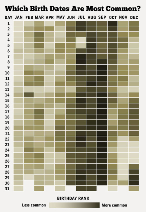
The days of the year, ranked by the number of babies born on each day in the United States (Matt Stiles, NPR data journalist)
Flowcharts [are] a form of poetry. And poetry is its own reward.Indeed, flowcharts have a singular way of living at the intersection of the pragmatic and the existential:
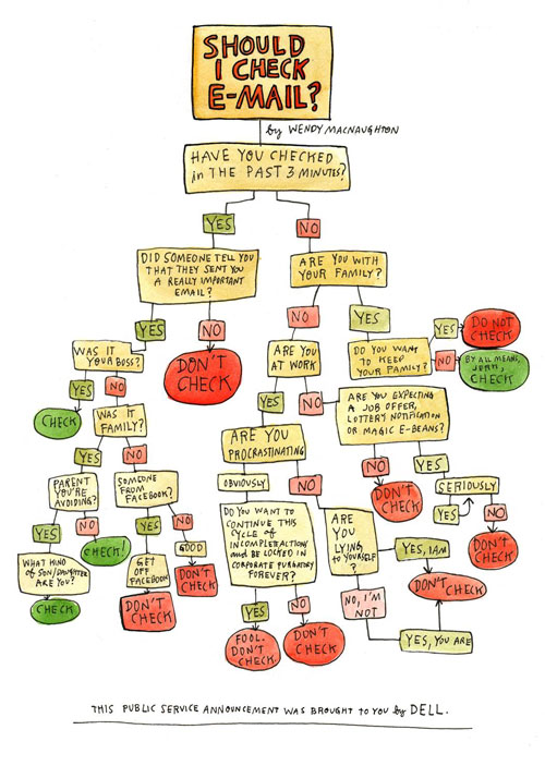
A handy flowchart to help you decide if you should check your email. (Wendy MacNaughton, independent illustrator, for Forbes)
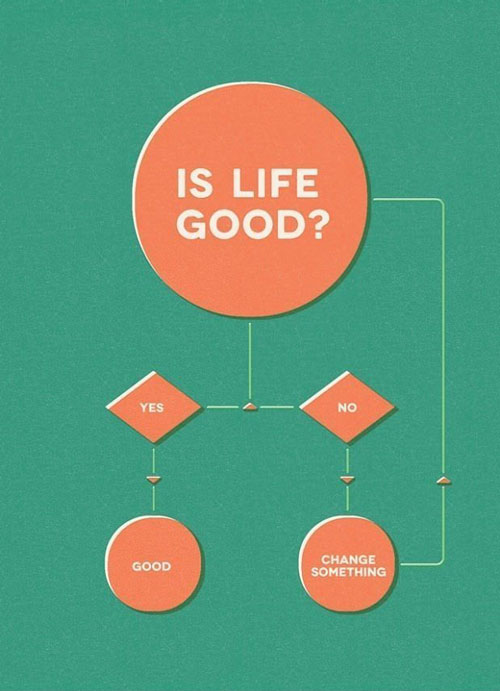
Just ask yourself one question. (Gustavo Vieira Dias, creative director of DDB Tribal Vienna)
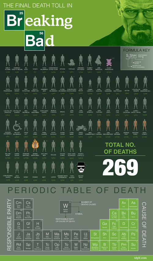
All of the deaths in the first fifty-four episodes of AMC's ‘Breaking Bad,’ with each deceased character represented by a faux chemical formula indicating when he or she died, how they died, and who killed them. (John D. LaRue)
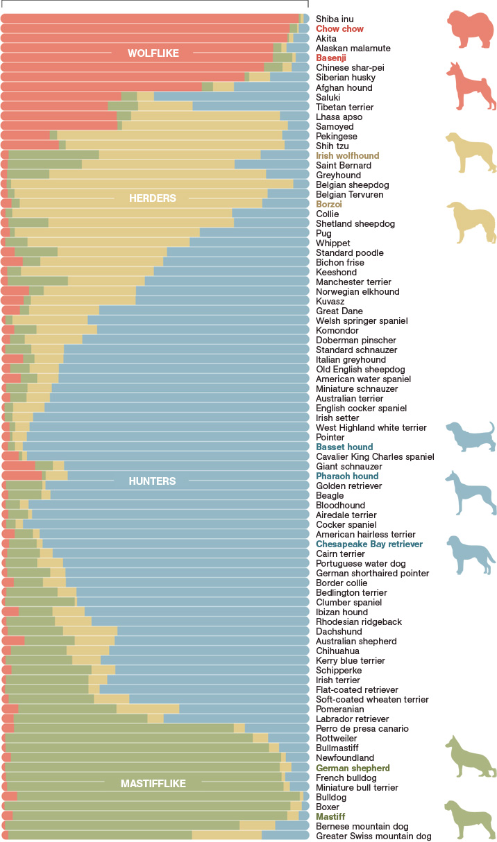
Analyzing the DNA of 85 dog breeds, scientists found that genetic similarities clustered them into four broad categories. The groupings reveal how breeders have recombined ancestral stock to create new breeds; a few still carry many wolflike genes. Researchers named the groups for a distinguishing trait in the breeds dominating the clusters, though not every dog necessarily shows that trait. The length of the colored bars in a breed’s genetic profile shows how much of the dog’s DNA falls into each category. (John Tomanio, senior graphics editor, National Geographic)
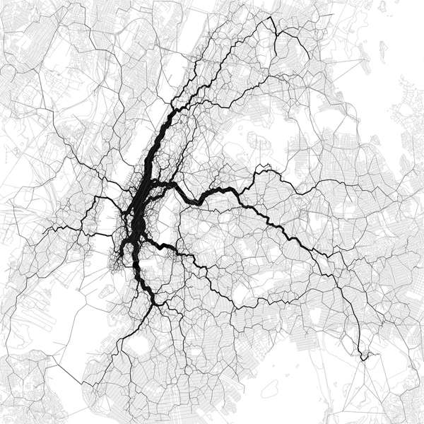
‘Flow map’ of travel in New York City derived from the locations of tweets tagged with the locations of their senders. The starting and ending points of each trip come from a pair of geotagged tweets by the same person, and the path in between is an estimate, routed along the densest corridor of other people's geotagged tweets. (Eric Fischer, artist in residence at the Exploratorium in San Francisco)
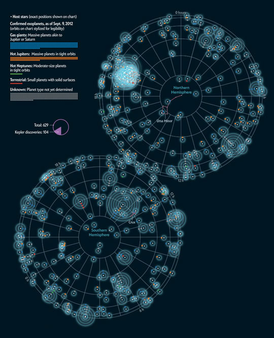
All of the planets discovered outside the Solar System. (Jan Willem Tulp, freelance information designer, for Scientific American)
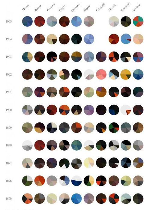
A revolution in color over ten extraordinary years in art history. Each pie chart represents an individual painting, with the five most prominent colors shown proportionally. (Arthur Buxton)

The availability of produce in the northern hemisphere by month and season. (Russell van Kraayenburg)
We have an inbuilt ability to manipulate visual metaphors in ways we cannot do with the things and concepts they stand for — to use them as malleable, conceptual Tetris blocks or modeling clay that we can more easily squeeze, stack, and reorder. And then — whammo! — a pattern emerges, and we’ve arrived someplace we would never have gotten by any other means.Complement The Best American Infographics 2013 with Nathan Yau’s indispensable guide to telling stories with data and Taschen’s scrumptious showcase of the best information graphics from around the w


No comments:
Post a Comment